
Supply Chain Platform
Price repository and invoicing
1
Project details
- Product: Web app | B2B enterprise solution
- Client: SingPost
- Role: Product designer
- Team: Product lead (Fon), Product manager (Zhang Qing), Tech lead (Satish), Developers
- Tool: Figma, Confluence, Jira, Miro
2
Deliverables
- User and market research
- User flows
- Wireframes
- UI mockups
- Design handoff and collaboration with developers
3
Problem
Creating an invoice sounds straightforward until the information you need is spread across different parts of the system.
For this platform, shipping prices and other billing information were not managed in one central place. Teams had to pull information from different sources and manually piece everything together before an invoice could be generated.
This created a few problems:
- Pricing information was harder to verify.
- Manual work increased the chance of errors.
- Finding the right shipment information took time.
- Invoice creation could become inconsistent, especially when dealing with many shipments.
The bigger issue was not just invoicing itself. The team needed a more reliable way to manage and retrieve pricing information across the platform.
4
UX research phase
Before jumping into the UI, I wanted to understand how pricing and invoicing worked in the real world.
We used a combination of stakeholder discussions, contextual inquiry, and competitive analysis to understand the current workflow and where users were struggling.

Stakeholder Discussion
We started by speaking with the key stakeholders to understand the business requirements, operational constraints, and what they expected the new solution to achieve.
One issue came up repeatedly:
There was no single place where teams could go to find and verify pricing information.
That became an important direction for the project.
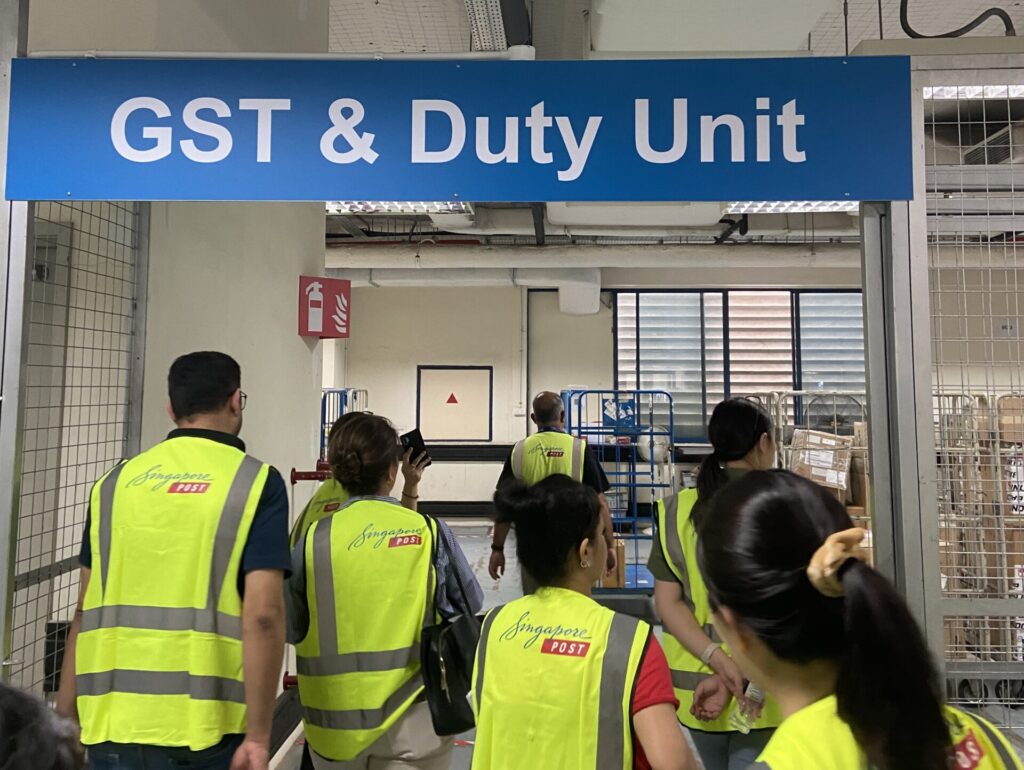
Contextual Inquiry
To understand the day-to-day workflow, we visited the Changi Airfreight Centre and observed how users managed shipment and pricing information.
We found that pricing data came from multiple sources and required significant manual coordination, increasing the risk of errors. This highlighted the need for a simpler, more manageable workflow.
Competitive Analysis
I also looked at other supply chain and logistics SaaS products to understand how they handled pricing, quotations, and invoicing.
This helped us identify common patterns in the industry and, more importantly, gave us ideas for making pricing information easier to search, review, and use.
5
Proposed solution
Based on the research, I focused on two main areas.
Centralise pricing information
We introduced a Price Repository as a single place to store and retrieve shipment pricing data.
Instead of looking across multiple sources, users could use the repository to find the information they needed and understand how it related to a shipment, customer, or route.
The goal was simple: make pricing information easier to find and easier to trust.
Make invoice creation more reliable
The repository also became the foundation for invoice generation.
By connecting invoice creation to the relevant shipment pricing information, users could generate invoices using the latest available pricing data instead of manually piecing the information together.
6
UI design
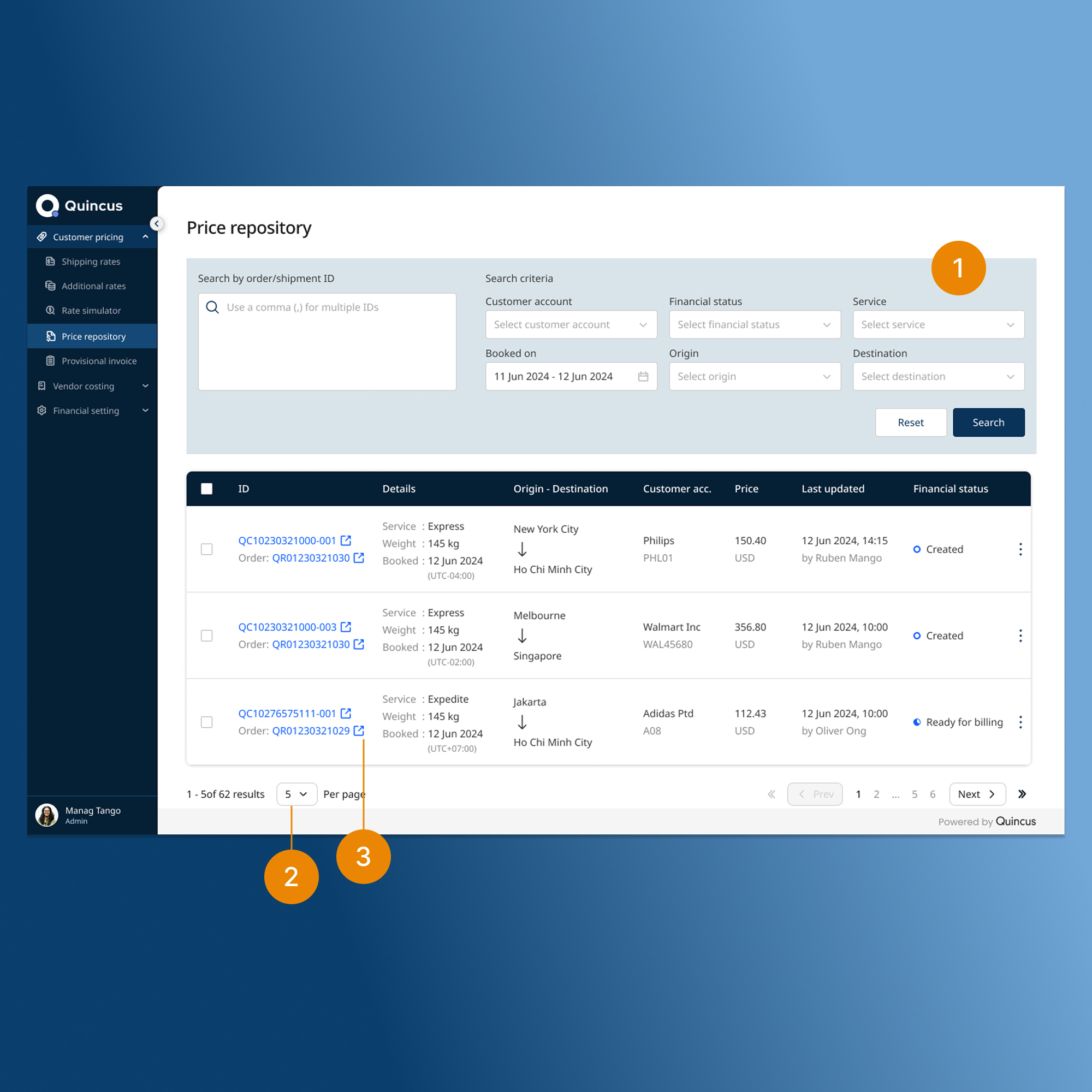
Price repository
The Price Repository became the main workspace for finding shipment pricing information.
Because users could potentially be working with a large number of shipments, search and filtering were important parts of the experience.
Users could:
- Search and filter shipments using key information such as shipment ID, customer, financial status, and route.
- Control how many records they wanted to see on a page.
- Click shipment or order IDs to open the relevant details.
The idea was to help users get from a large dataset to the specific record they needed without having to manually scan through everything.
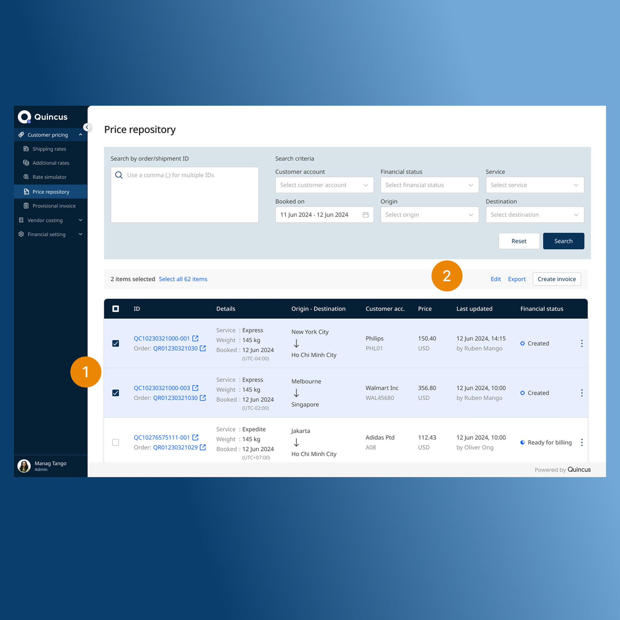
Bulk action
The platform also needed to support users who were working with shipments in large volumes.
Instead of making users repeat the same action one shipment at a time, I introduced multi-select (1) and bulk actions (2).
Users could select multiple records and:
- Edit them together
- Export them to Excel
- Combine shipments into a single invoice
This was especially useful for repetitive invoicing tasks and helped reduce unnecessary manual work.
Shipment price details
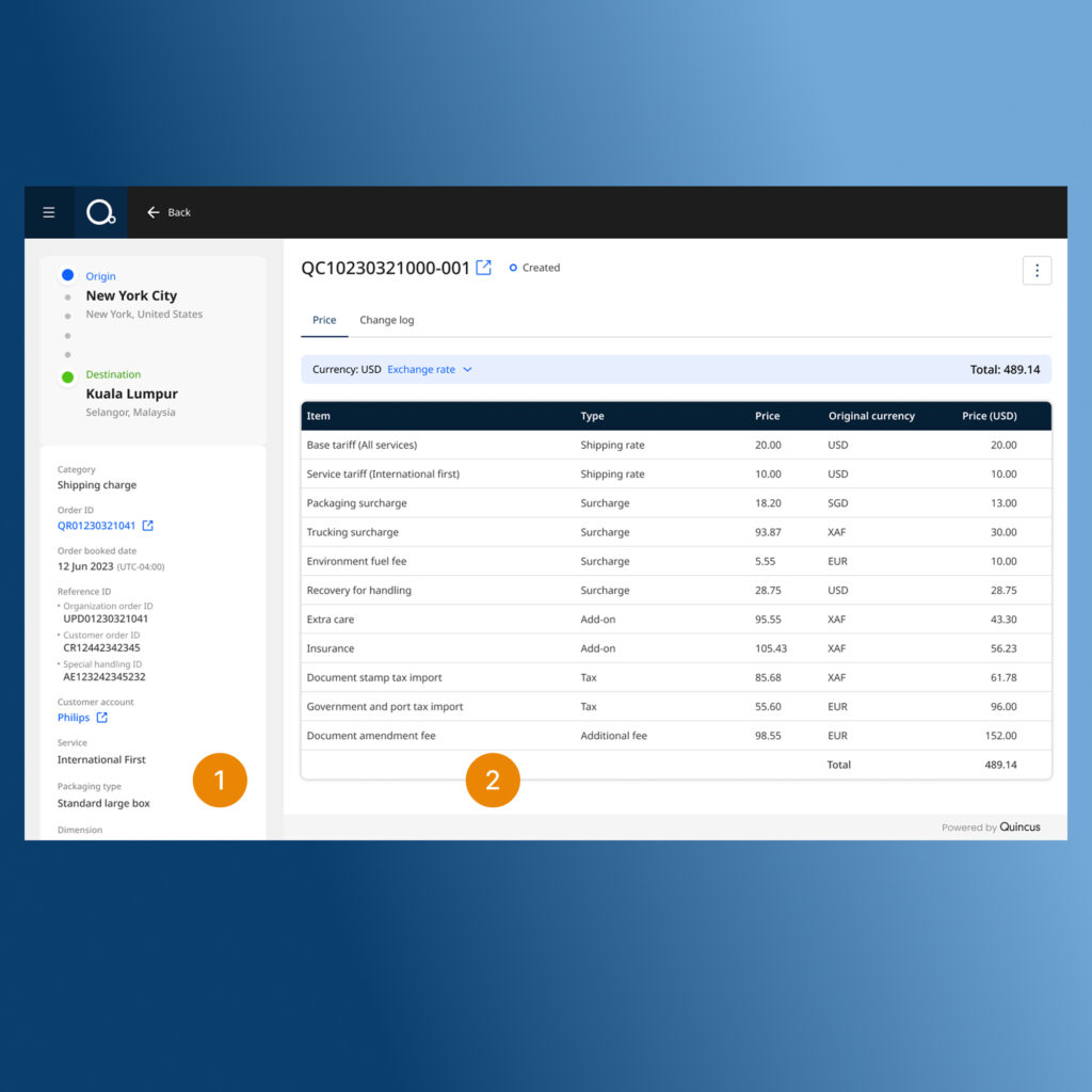
When users opened an individual shipment, they needed to understand both the shipment itself and how its final price was calculated.
I designed the page around a two-column layout.
- The left side gives users the shipment context, including key information such as the customer, weight, and items.
- The right side focuses on the financial breakdown, showing the different charges, surcharges, and taxes that make up the final amount.
Keeping these two pieces of information visible together meant users could check the shipment details against the charges without constantly moving between screens.
Invoice preview
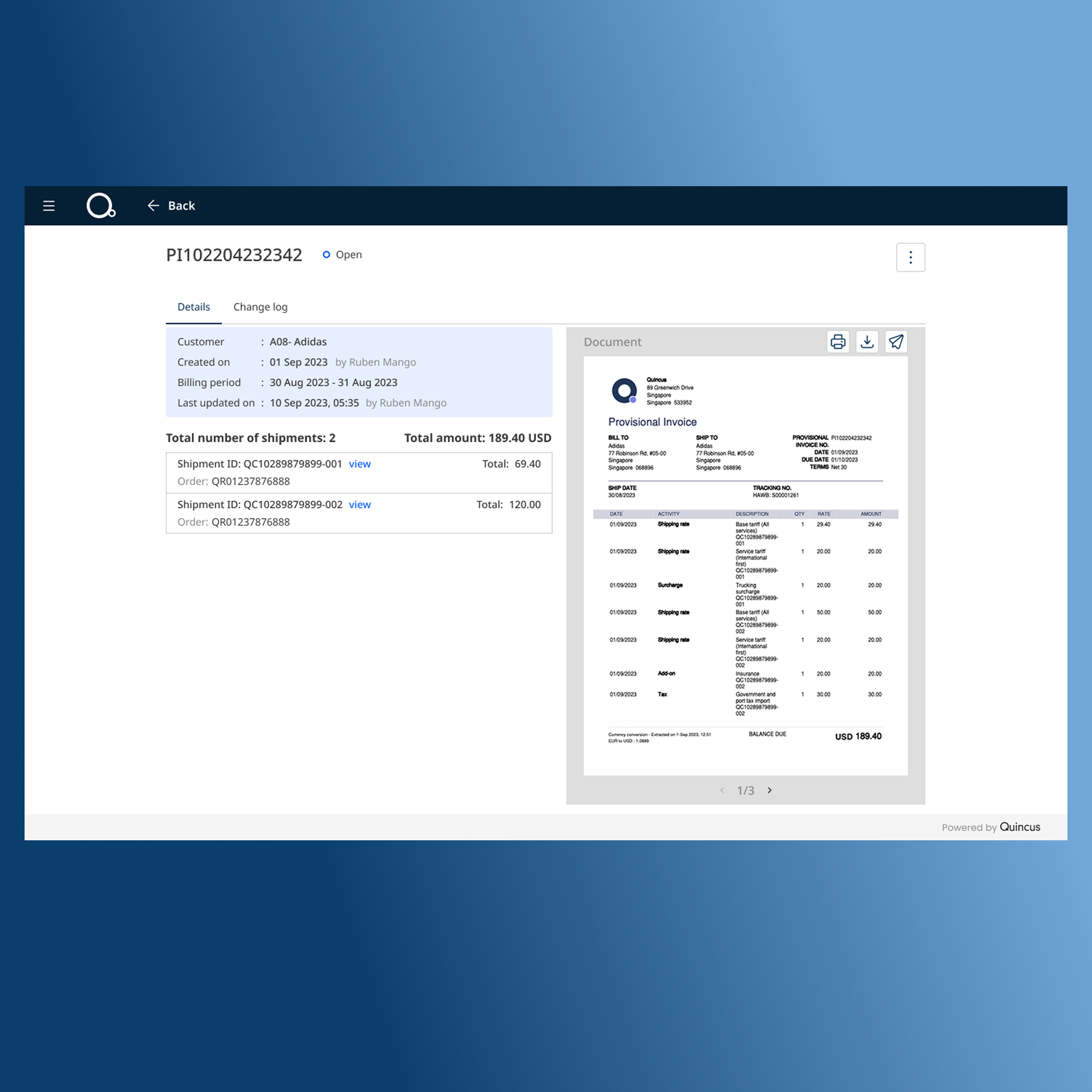
I also introduced an invoice preview so users could check the invoice before sending or saving it. Rather than generating a file and opening it somewhere else, users could review the PDF directly within the platform.
From there, they could email, print or download the invoice. The preview also kept the related shipment information visible, making it easier to understand what the invoice was made up of before taking the next action.
Billing configuration
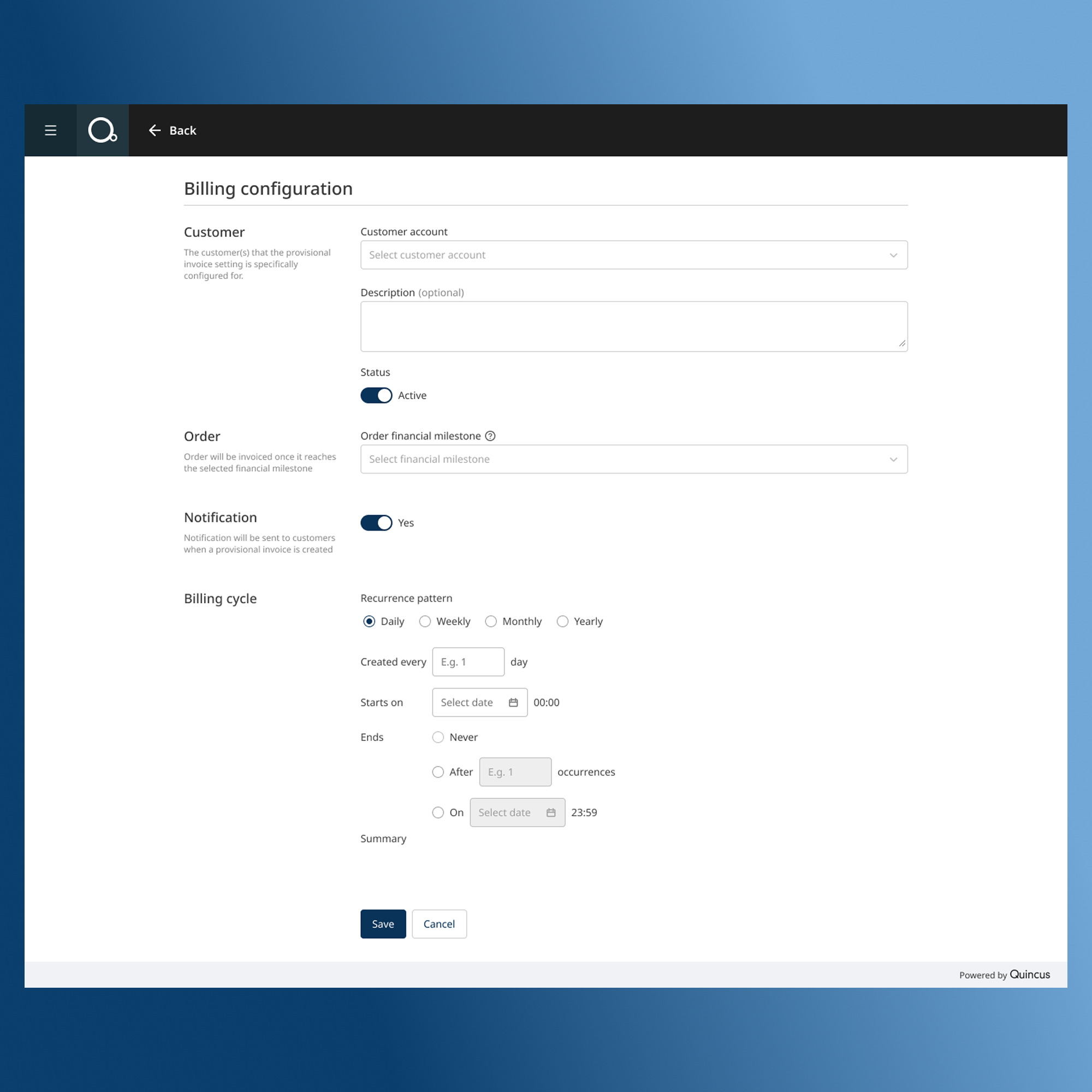
Not every customer follows the same billing schedule. For businesses with recurring billing requirements, we introduced billing configuration so users could set up automated invoice generation based on their preferred billing cycle.
This gave the platform two options: users could create invoices manually when needed, or configure recurring invoices for customers who followed a regular billing schedule.
7
Design system
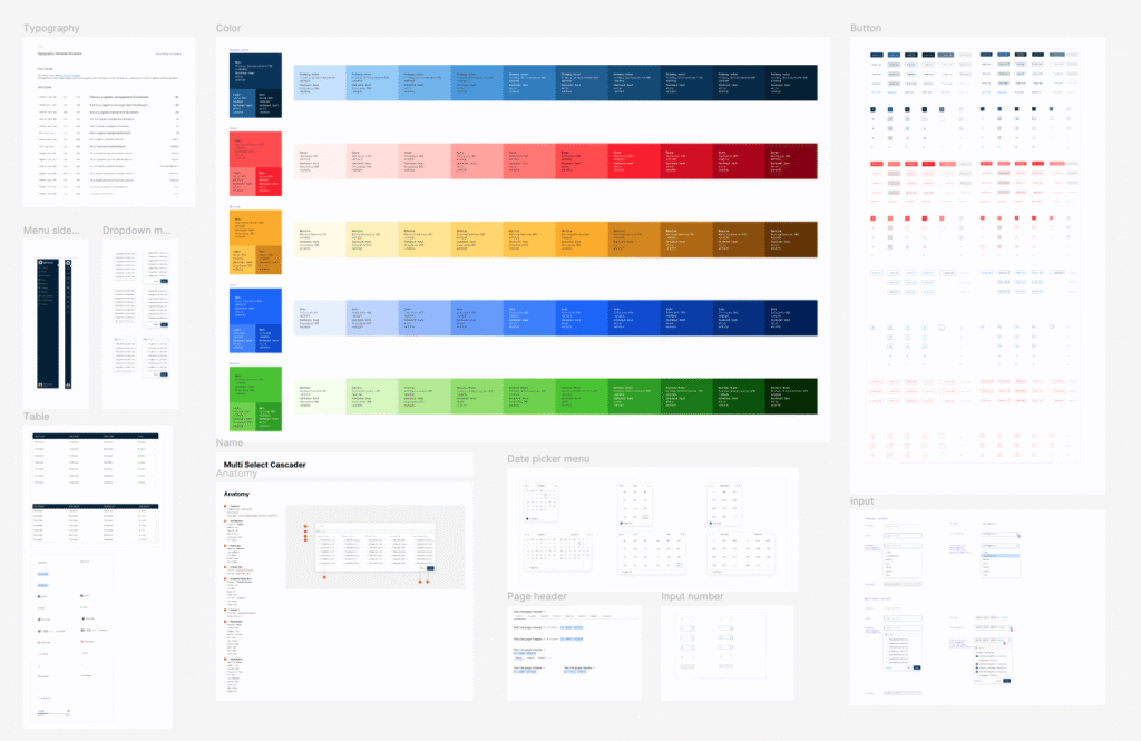
As this was a data-heavy B2B platform, consistency became increasingly important as more screens and features were designed. I worked with the design team to build and maintain a reusable design system in Figma.
The system included everything from basic UI components to more complex patterns such as data tables and interactive elements. This gave the team a shared foundation to work from and made it easier to design new features without reinventing the UI each time.
More importantly, it helped us keep the experience consistent as the platform continued to grow.
8
Reflections
One of the biggest lessons from this project was that data-heavy does not automatically have to mean difficult to use.
In a logistics platform, there will always be a lot of information on screen. The challenge is deciding what users need to see first, what can be hidden until they need it, and how everything should be organised so they can still understand the page quickly.
A few principles became especially important in my design decisions:
Prioritise the information that matters most.
Not every piece of data deserves the same visual weight. Important information should be easy to find, while supporting details can sit further down the hierarchy.
Use progressive disclosure.
Instead of showing everything at once, reveal more detail when the user needs it. This keeps complex workflows manageable without removing useful information.
Design around the task, not just the data.
A page can contain all the right information and still be difficult to use. The interface needs to help users complete the job they came to do.
This project also reinforced how important it is to understand the operational workflow behind a B2B product. The final UI was only one part of the solution; understanding how teams actually worked with the data was what helped shape the experience.