
Visa Airport Companion
Redesigning the Ride Booking Experience
1
Project Overview
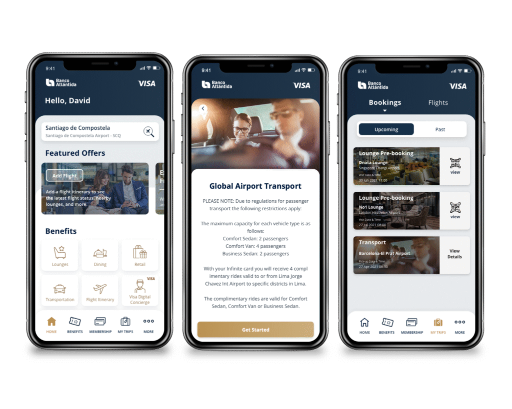
Visa Airport Companion is a travel companion app that provides eligible Visa cardholders with access to travel benefits and services. As a UX Designer, I worked across multiple experiences within the app, including ride booking, flight itinerary and lounge pre-booking.
This case study focuses on the redesign of the ride booking experience, where I explored ways to make free ride coverage and pricing clearer, reduce unnecessary friction, and create a more flexible booking journey.
I contributed across the end-to-end design process, including UX evaluation, interaction design, information architecture, UI design, prototyping, scenario-based usability review, iteration, edge-case handling and UX writing.
The design evolved through iterations, with prototype feedback and scenario-based usability review helping shape the final experience.

- Role: UX Designer
- Tools used: Adobe XD, Photoshop, Axure RP, Miro
- Client: Visa
- Target Audience: Visa Infinite, Signature, Platinum cardholders
2
The Challenge
Customers sometimes selected an entitlement with the expectation that their ride would be fully covered, only to discover that certain vehicle types required an additional upgrade fee. This misunderstanding resulted in a high volume of calls to customer support, with customers querying unexpected charges on their transactions.
How might we make the ride booking journey clearer and easier to understand while reducing unnecessary decisions and confusion around entitlements and pricing?
3
Understanding the Existing Experience
I reviewed the existing ride booking journey and identified several opportunities.
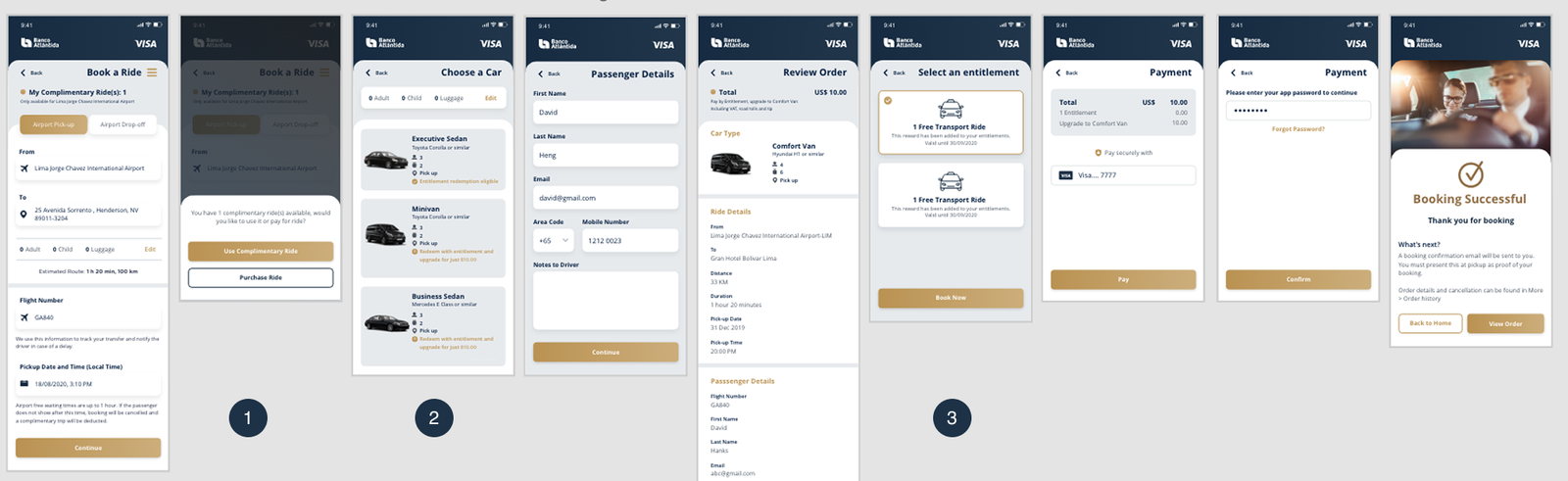
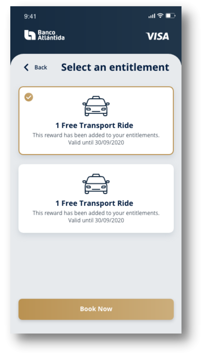
01 — Unclear ride coverage and pricing
The existing experience could lead users to assume that selecting a Complimentary Ride meant the entire booking would be covered, even though some vehicle options could require an additional payment.
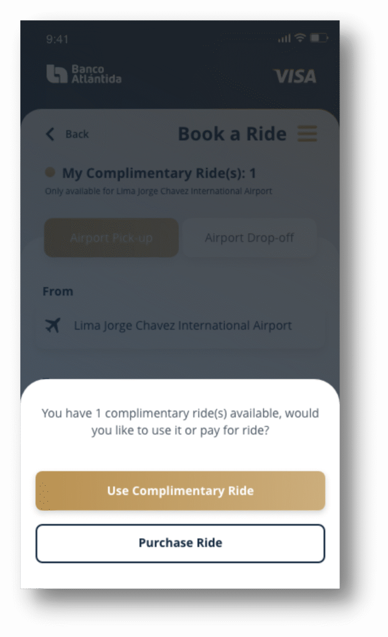
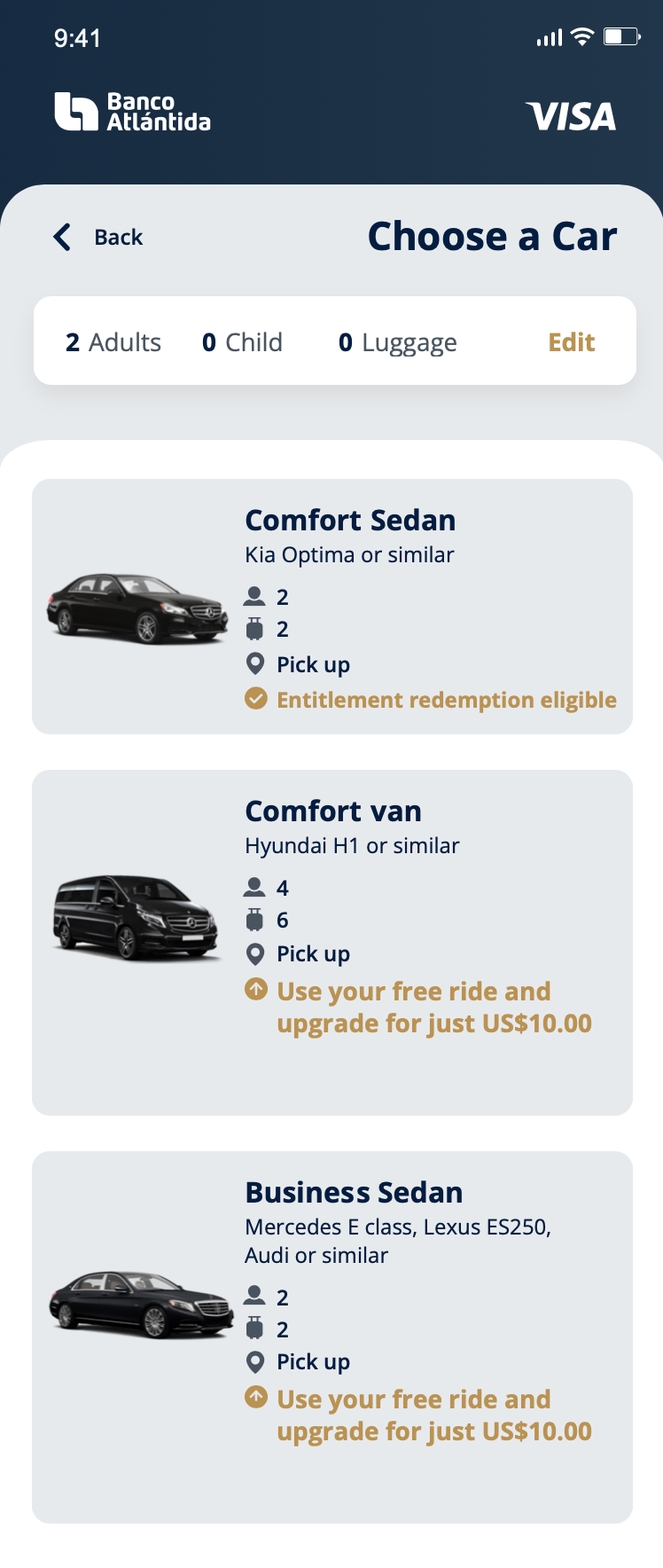
02 — Unclear vehicle and pricing information
Important information such as vehicle capacity, ride coverage and any additional fee could be made more visible and easier to understand at the point of selection.
03 — Unnecessary decision-making
Users were asked to select a ride entitlement after reviewing order during the booking process even though the system could determine the appropriate ride automatically, adding an unnecessary step to the journey.
4
Design Principles
1. Principle of Least Astonishment (POLA)
2. Reduce Cognitive Load
Minimise unnecessary decisions, information and steps so users can complete the booking confidently and efficiently.
3. Error Prevention
A confirmation message makes the additional payment explicit before users proceed, helping prevent unexpected charges and misunderstandings.
5
Design 1
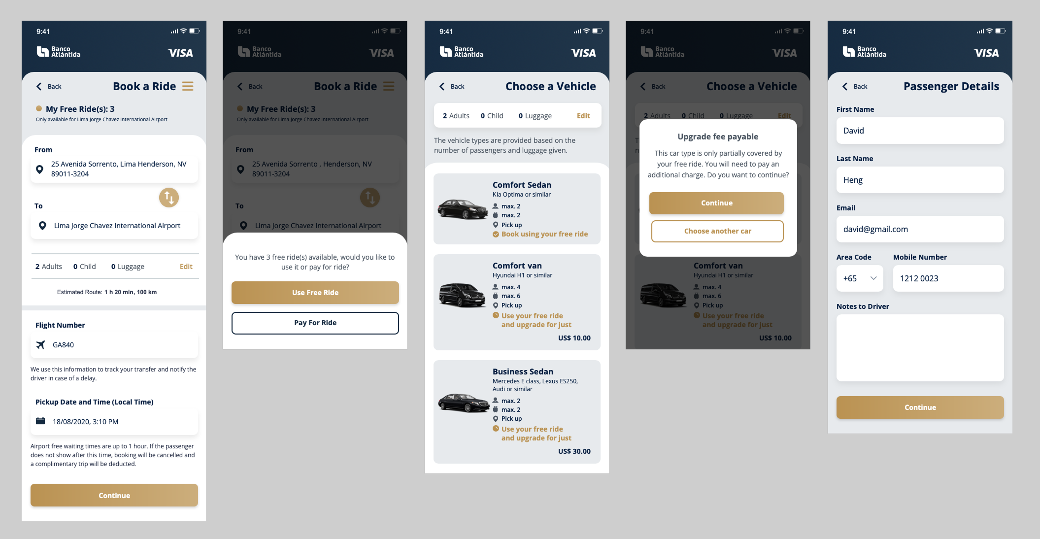
01 — Acknowledging additional fees
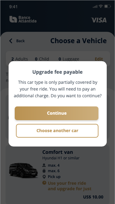
The existing experience could give users the impression that selecting a “Complimentary ride” meant the entire ride would be covered. For the mobile interface, I kept “Free Ride” as the label because it is shorter and more suitable for limited screen space.
Instead of relying on terminology alone to communicate the entitlement conditions, I introduced a confirmation pop-up before users proceeded with the booking.
The confirmation provides an opportunity to clearly communicate whether the selected vehicle is fully covered or requires an additional payment, allowing users to understand the cost before committing to the booking.
02 — Making vehicle coverage clearer
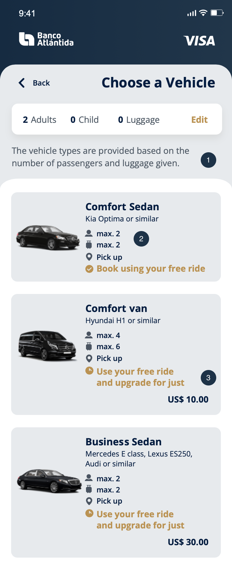
I refined the vehicle selection screen to make important information easier to understand. The redesign introduced:
- Clearer explanation of the vehicle filter
- Show maximum passenger capacity
- More visible additional payment (consistent price tag pattern)
03 — Reframing the entitlement selection screen
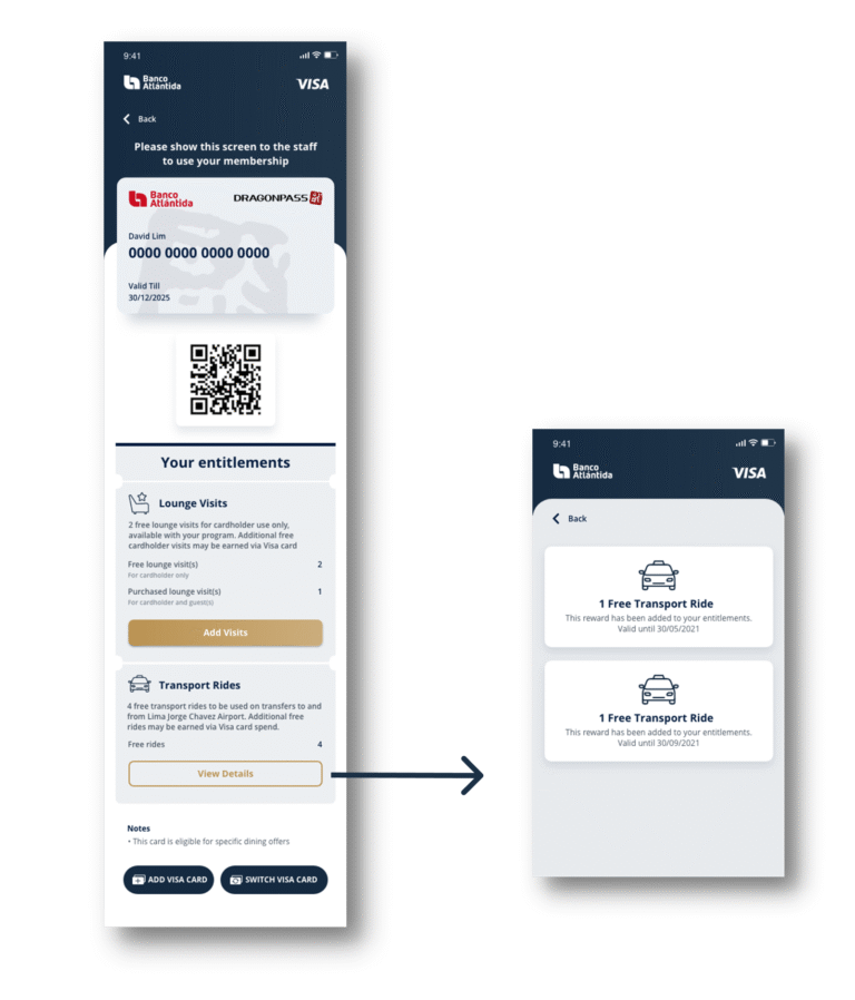
I found the Select an Entitlement screen somewhat redundant because users had already decided to use an entitlement earlier in the booking flow.
Instead of removing the information altogether, I explored moving the entitlement details into the Membership screen, with a View Details entry that allowed users to access information such as the entitlement expiry date.
This kept the information available when users needed it, while removing an additional decision from the booking journey. I also explored having the system automatically apply the entitlement with the earliest expiry date, as the available entitlements did not provide a meaningful choice beyond their expiry dates.
6
Usability Review
To validate the first design, I conducted a scenario-based usability review with Product Managers and colleagues based in the UK.
Rather than reviewing individual screens in isolation, I asked reviewers to walk through the interactive prototype by simulating realistic user tasks and goals, such as booking a ride and checking their transport entitlement expiry date.
Two findings stood out:
4 out of 5 preferred “Use My Location”
Most reviewers felt that having a Use My Location option would make the pickup and drop-off experience more convenient. This prompted me to reconsider the existing tab structure rather than simply refining the first design.
5 out of 5 found the entitlement expiry information confusing
Although moving the entitlement details to the Membership screen reduced friction within the booking flow, the review revealed another issue: users found it difficult to understand the different expiry dates for Membership and Spend Based Rewards entitlements.
The combined number of transport rides was useful as an overview, but the different entitlement types naturally followed different expiry rules. This led me to further refine the information architecture in the final design.
7
Iteration: Design 1 → Design 2
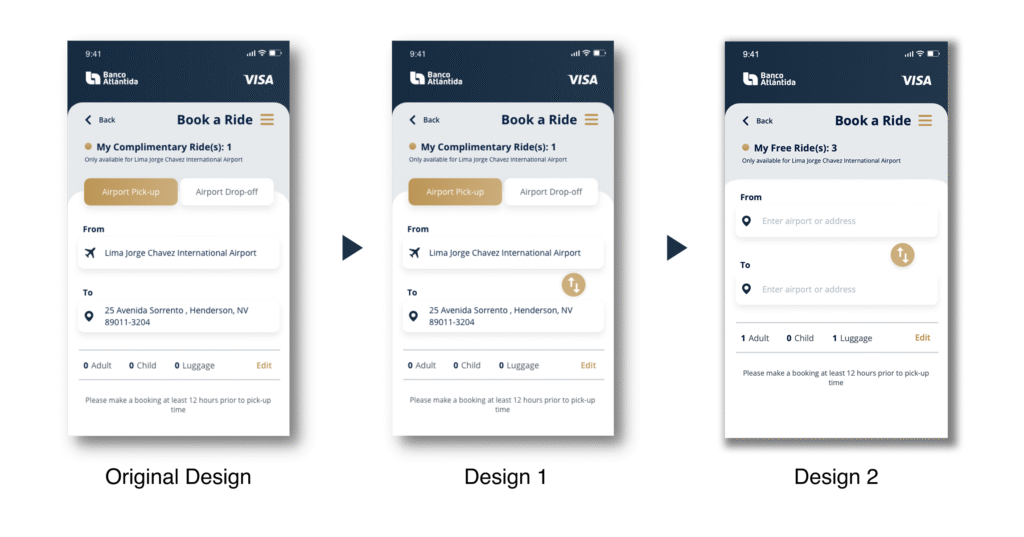
From a switch to flexible location input
First design
As a quick usability improvement, I added a switch between the pickup and drop-off fields so users could reverse their locations without re-entering them. While this was a relatively small interaction tweak, the prototype review revealed a bigger opportunity to rethink the location input experience.
Feedback
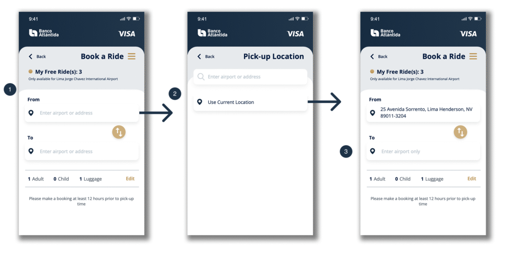
4 out of 5 reviewers preferred having a Use My Location option. I therefore reconsidered whether the existing airport pickup/drop-off tabs were the right interaction model.
iteration
- I removed the rigid airport pickup/drop-off tabs and allowed users to enter an airport or address in either the From or To field, with Use My Location available as an additional option.
- The location icon was also changed from an airplane icon to a location pin to better represent the interaction.
- The system could then determine whether the selected location represented an airport pickup or drop-off and apply the relevant constraints (e.g. Enter airport only).
Design Shift
From restricting the user’s input upfront → to allowing flexible input and letting the system interpret it.
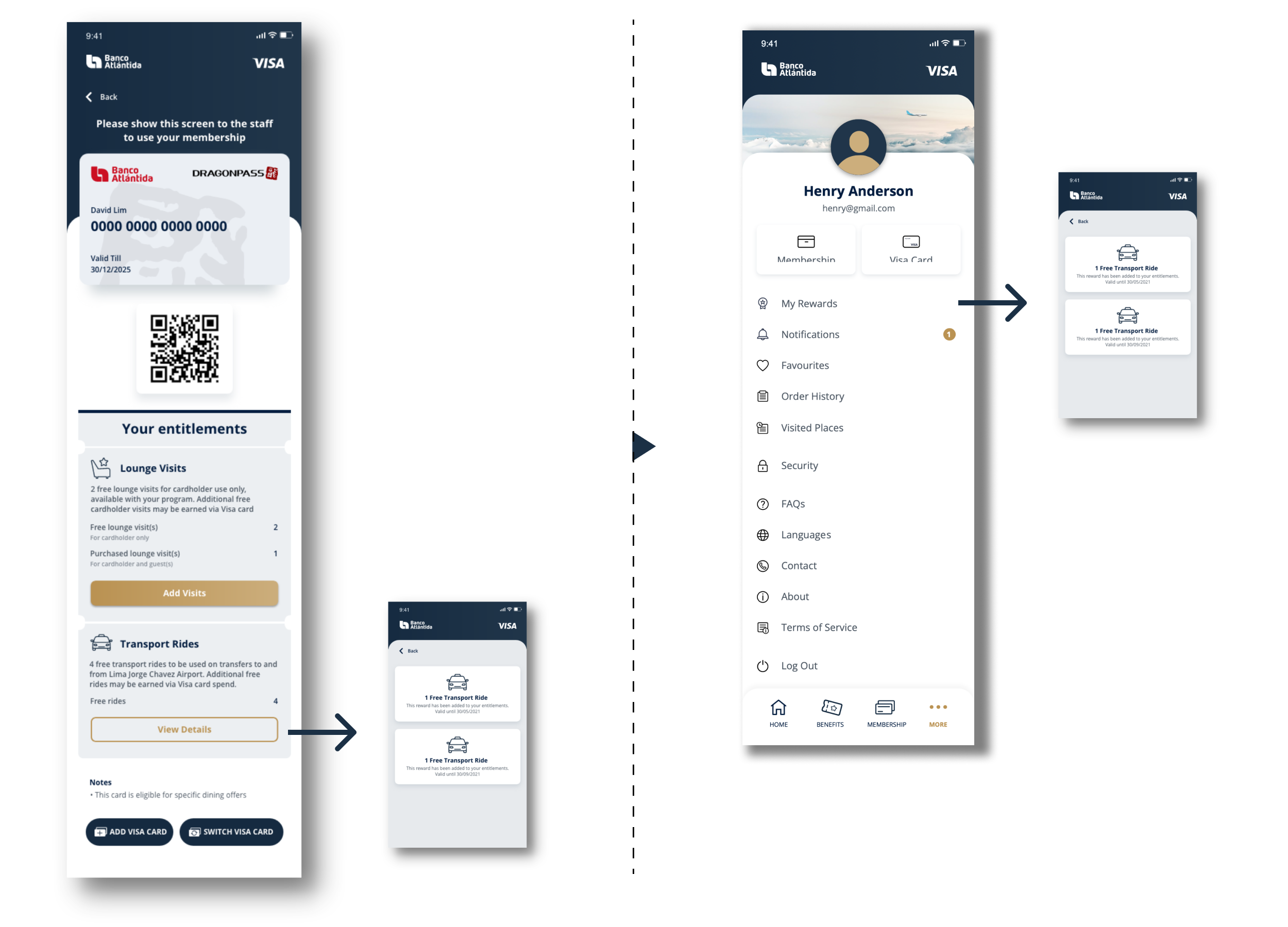
From combined entitlement details to clearer information architecture
First design
I explored placing transport entitlement details within the membership screen, with a View Details button providing information such as the expiry date.
Feedback
5 out of 5 reviewers found the expiry-date relationship confusing. They found it difficult to understand the different expiry dates for Membership and Spend Based Rewards entitlements.The combined entitlement count was still useful as an overview, but different entitlement types naturally had different expiry rules.
iteration
- I retained the combined total of transport rides with a note on the membership screen for a convenient overview.
- For more detailed information, I separated the Spend Based Rewards entitlement information into My Rewards, including details such as expiry date.
- This preserved the convenience of an at-a-glance overview while giving each entitlement type a clearer context.
Design Shift
From combining information for convenience → to separating detailed information where context matters.
8
Edge Cases & Scenario Handling
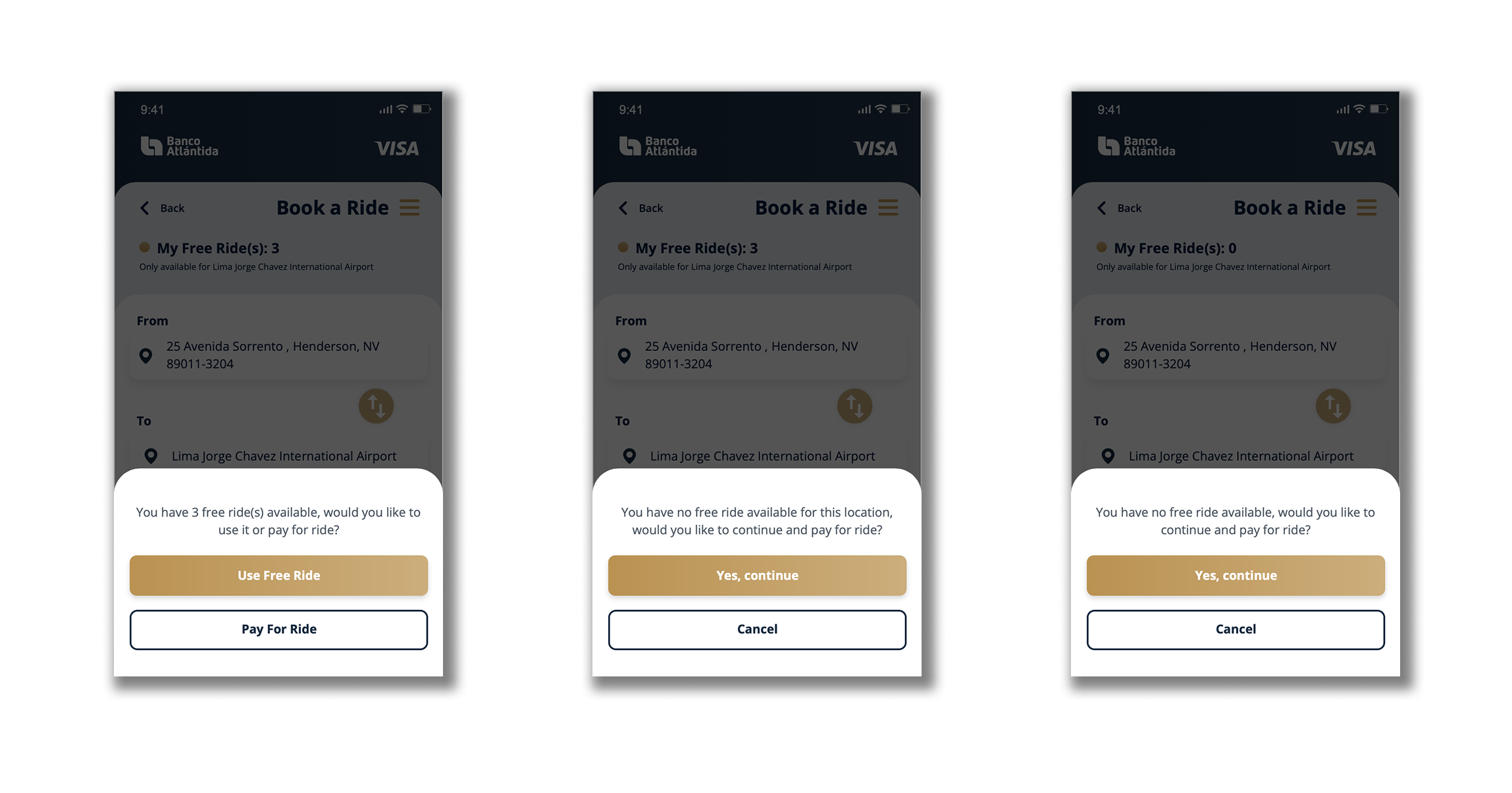
Once the main flow had been refined, I considered how the experience should behave across different entitlement scenarios rather than focusing only on the ideal journey.
I reviewed 3 key scenarios:
- Entitlement available
- Entitlement unavailable at the selected location or airport
- No entitlement available
These scenarios helped ensure that the booking experience did not rely solely on the happy path, and that the messaging and interface states remained understandable when entitlement coverage differed.
9
Final Experience
The redesign focused on making the user’s financial commitment and entitlement coverage clearer while reducing unnecessary steps in the journey.
Before
After
10
Outcome
The redesign addressed several sources of friction across the transport journey, including entitlement communication, pricing clarity, location input and unnecessary decision points.
More importantly, the final experience was shaped through multiple rounds of design and feedback rather than a single visual redesign.
By combining prototype feedback, interaction refinement, information-architecture changes, edge-case handling and UX writing, I developed a transport booking experience that was designed to be clearer, more flexible and more transparent for users.
11
Other Product Contributions
While ride booking was the main focus of this case study, I also contributed to other parts of the Visa Airport Companion experience. Working across ride booking, flight tracking, and lounge access gave me a broader view of the overall travel journey and reinforced the importance of creating a consistent experience across different features.
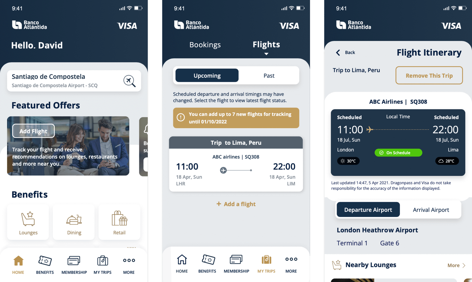
Flight Itinerary
I worked on the Flight Itinerary experience, allowing users to keep track of their upcoming flights and access key flight information in one place. The goal was to make travel details easier to review before and during the journey.
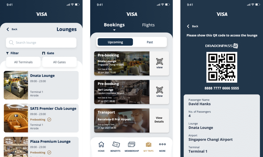
Lounge Pre-booking
I also contributed to the Lounge Pre-booking experience, which allows users to reserve lounge access in advance. This helps reduce uncertainty and avoids disappointment when lounges reach full occupancy.
12
What I Learned
- The biggest lesson from the project was that the first solution is not necessarily the final solution.
- The first design addressed several obvious usability and communication issues, but prototype feedback revealed deeper issues in the interaction model and information architecture. The final stage also reinforced that good product design extends beyond the primary journey.
- Considering edge cases and refining UX writing helped ensure that the experience remained clear and consistent across different scenarios.