
Sberbank Benefit
Mobile Responsive Website
1
Project Overview
Sberbank was moving its airport lounge benefit from physical membership cards to a digital experience powered by DragonPass.
My role was to design the responsive website that would support this transition, from registration and identity verification through to account access and lounge benefit redemption.
The project had an important design constraint: the website needed to feel like a natural part of Sberbank’s ecosystem. This meant working within the client’s branding and design system rather than simply applying the DragonPass visual style to a new website.
- Project Scope: Full Site Build & Mobile Responsive Website
- Role: UX Designer
- Tools Used: Figma, Adobe XD, Adobe Photoshop, Miro
- Client: Sberbank (Sber)
Deliverables
- User journey flows
- Responsive web UX/UI design
- Sber ID onboarding and registration flow
- Account dashboard
- Airport lounge search page
- Reusable UI components
- Edge cases and error states
- Developer handoff
2
Background & Strategic Context
Sberbank was going through a major digital transformation and expanding its ecosystem of consumer services.
For DragonPass, the partnership was an opportunity to bring its airport lounge service to a much larger customer base in Russia.
The existing experience was built around physical membership cards. The new solution needed to move users towards a digital membership experience using Sber ID for identity verification.
That created a few requirements for the new experience:
- Users needed a simple way to activate their benefit.
- Sber ID had to work smoothly as part of the onboarding flow.
- The experience had to support both smartphone users and people who did not use the Sberbank or DragonPass mobile apps.
- The website needed to follow Sberbank’s visual identity and design system.
The last point was particularly important. Even though DragonPass was providing the underlying service, the experience had to look and feel like something customers could trust within the Sberbank ecosystem.

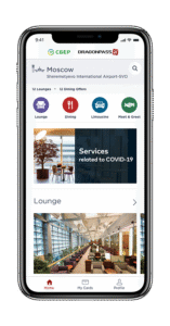
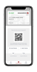
How might we create a simple and flexible onboarding experience that works for all Sberbank users, while staying consistent with Sberbank's existing brand and design system?
3
User Personas & Journey Mapping
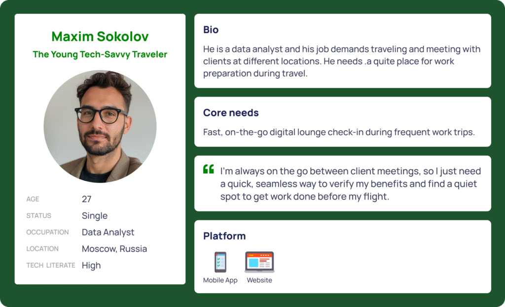
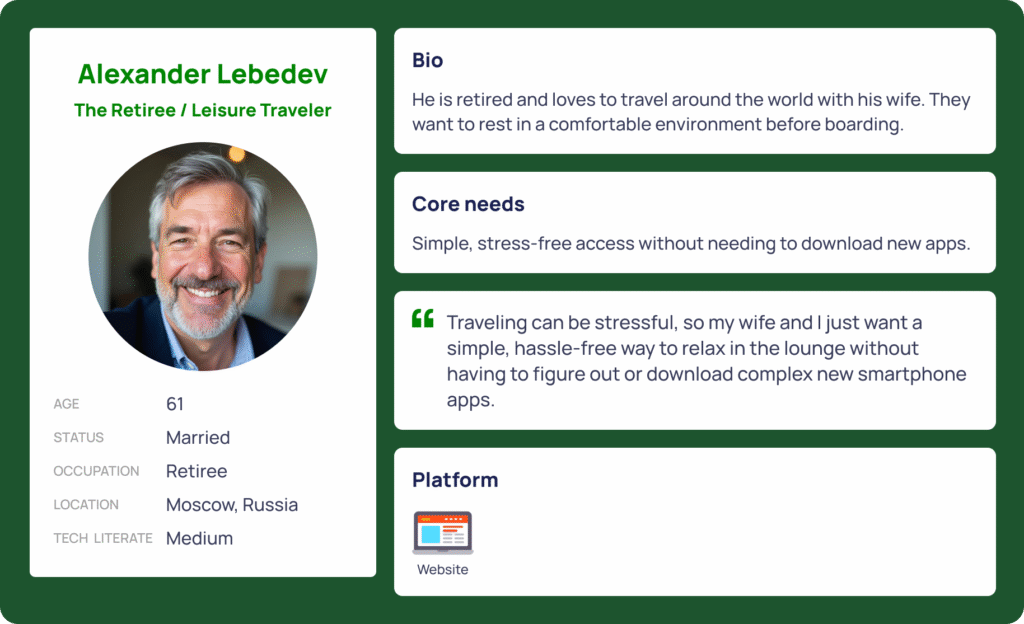
I started by mapping the different ways users could enter and complete the onboarding process. We identified two main user types.
a. Initial Concept: Two Separate Journeys
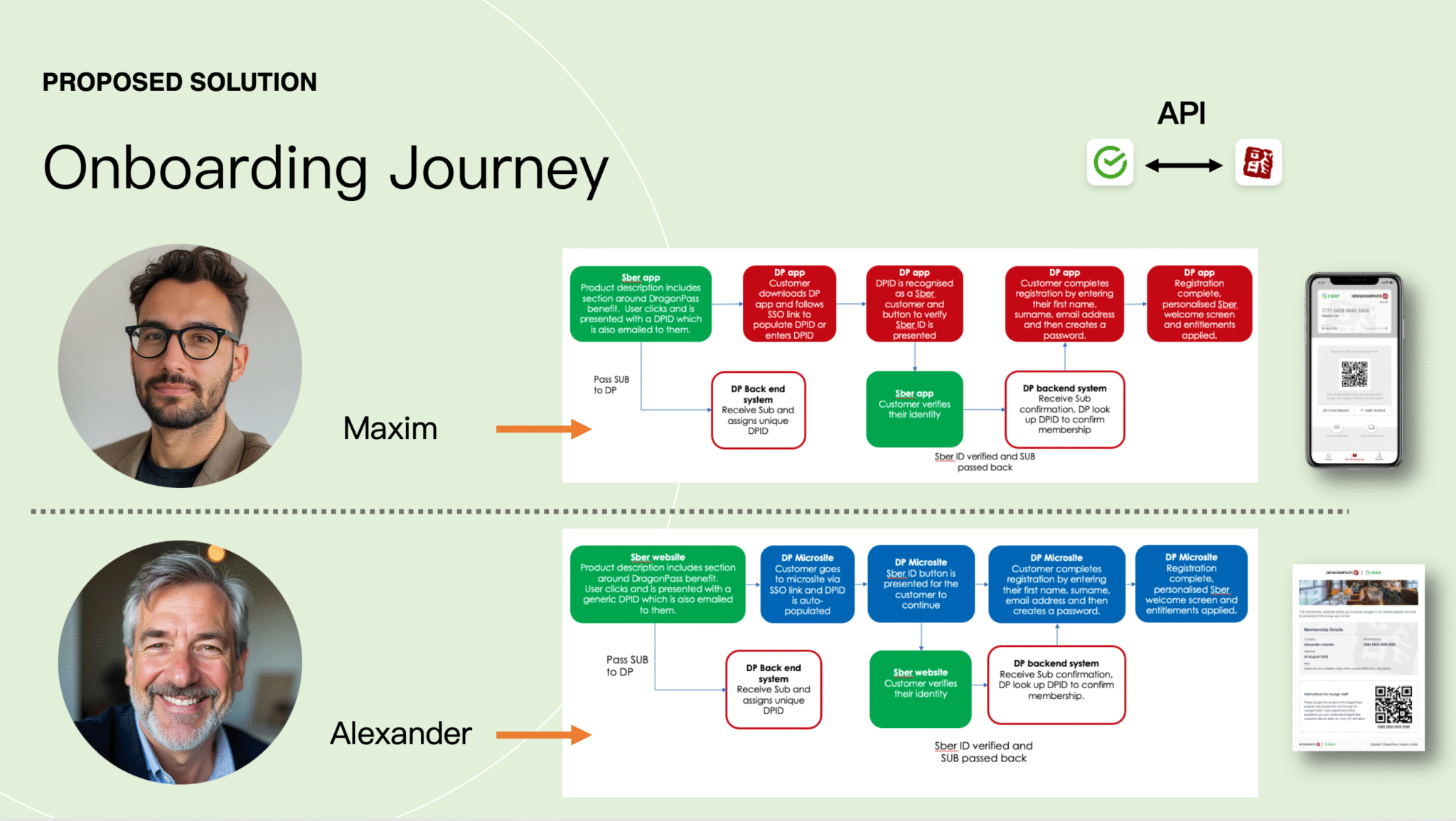
Mobile user (Maxim)
A smartphone user would start in the Sberbank app, move into the DragonPass app, complete Sber ID verification, and receive their digital membership.
Sber App → DragonPass App → Sber ID verification → Digital membership
Web user (Alexander)
A user without the mobile app would start from the Sberbank website and continue through a DragonPass web experience.
Sber Web Portal → DragonPass Website → Sber ID SSO → Account creation → Web dashboard / PDF voucher
At first, this separation seemed reasonable because the two groups had different needs.
But when we mapped the actual experience in more detail, I found a problem.
b. Identifying the Roadblock
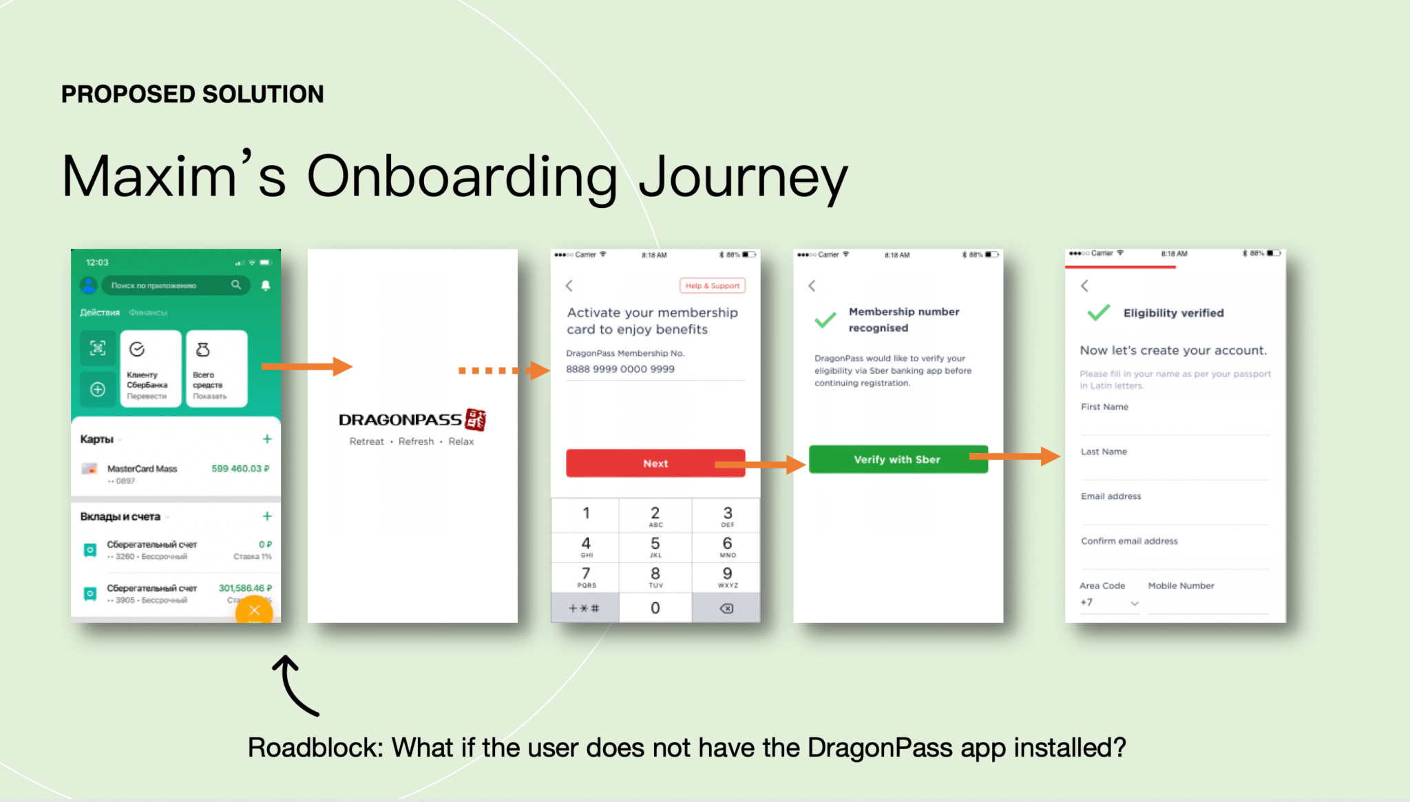
What happens when a smartphone user starts the process from the Sberbank app but doesn’t have the DragonPass app installed?
The original flow would require the user to leave the experience, go to the app store, download the DragonPass app, and then start the registration process again.
For a user who has just clicked on a benefit they want to use, that’s quite a lot of work before they even reach the first onboarding step. It also created a dependency on the DragonPass app that wasn’t necessary for the initial registration process.
That led me to rethink the structure of the experience.
c. The Pivot: One Responsive Web Entry Point
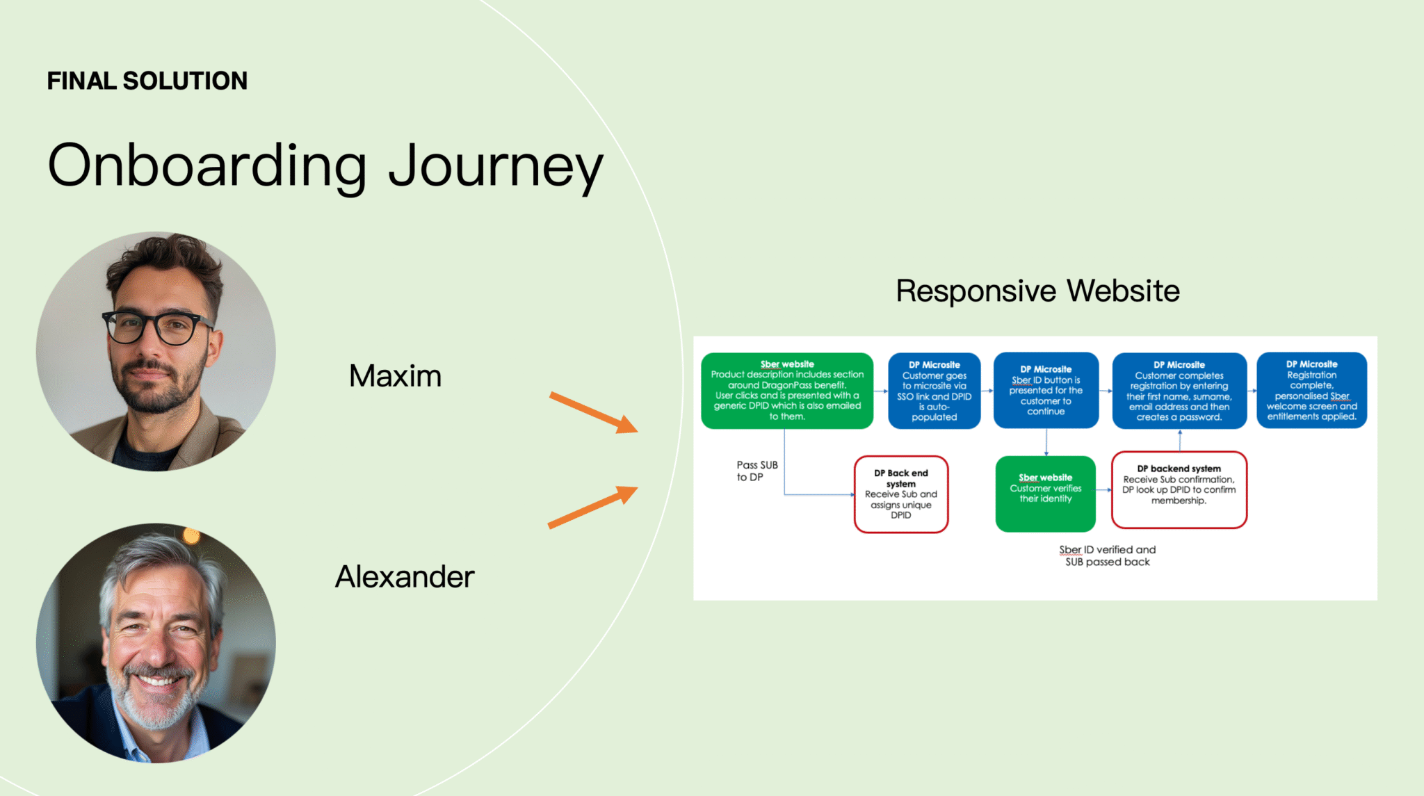
Instead of creating separate onboarding experiences based on the device, I moved the initial registration and verification flow to a responsive website.
This meant users could start from either the Sberbank app or website and complete the initial steps in the browser.
The flow became:
Sberbank → Responsive Website → Sber ID verification → Account setup → Appropriate access method
After registration:
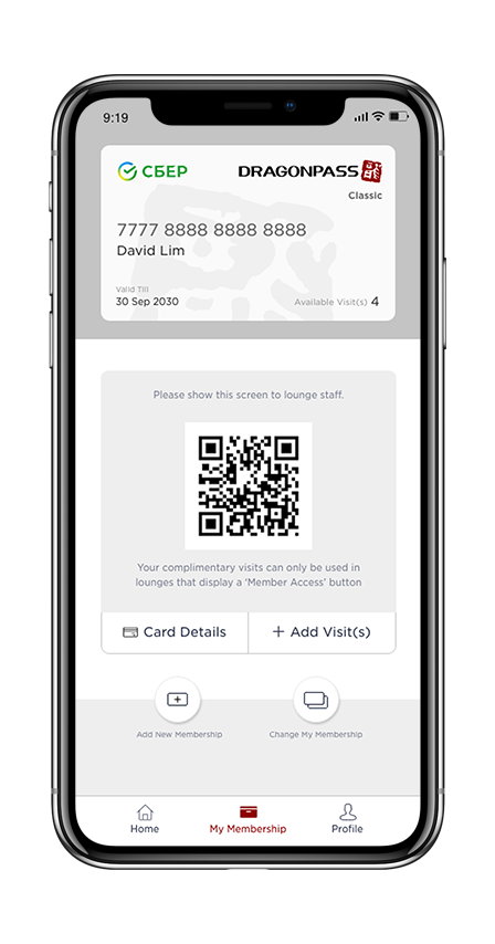
- Smartphone users could download the DragonPass app for digital access.
- Web users could continue using the website.
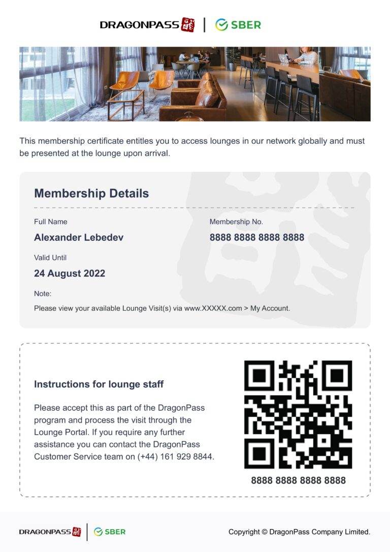
- Users who preferred a physical document could access and print a PDF voucher.
This made the entry point much more flexible and removed the need to download the app before completing registration.
5
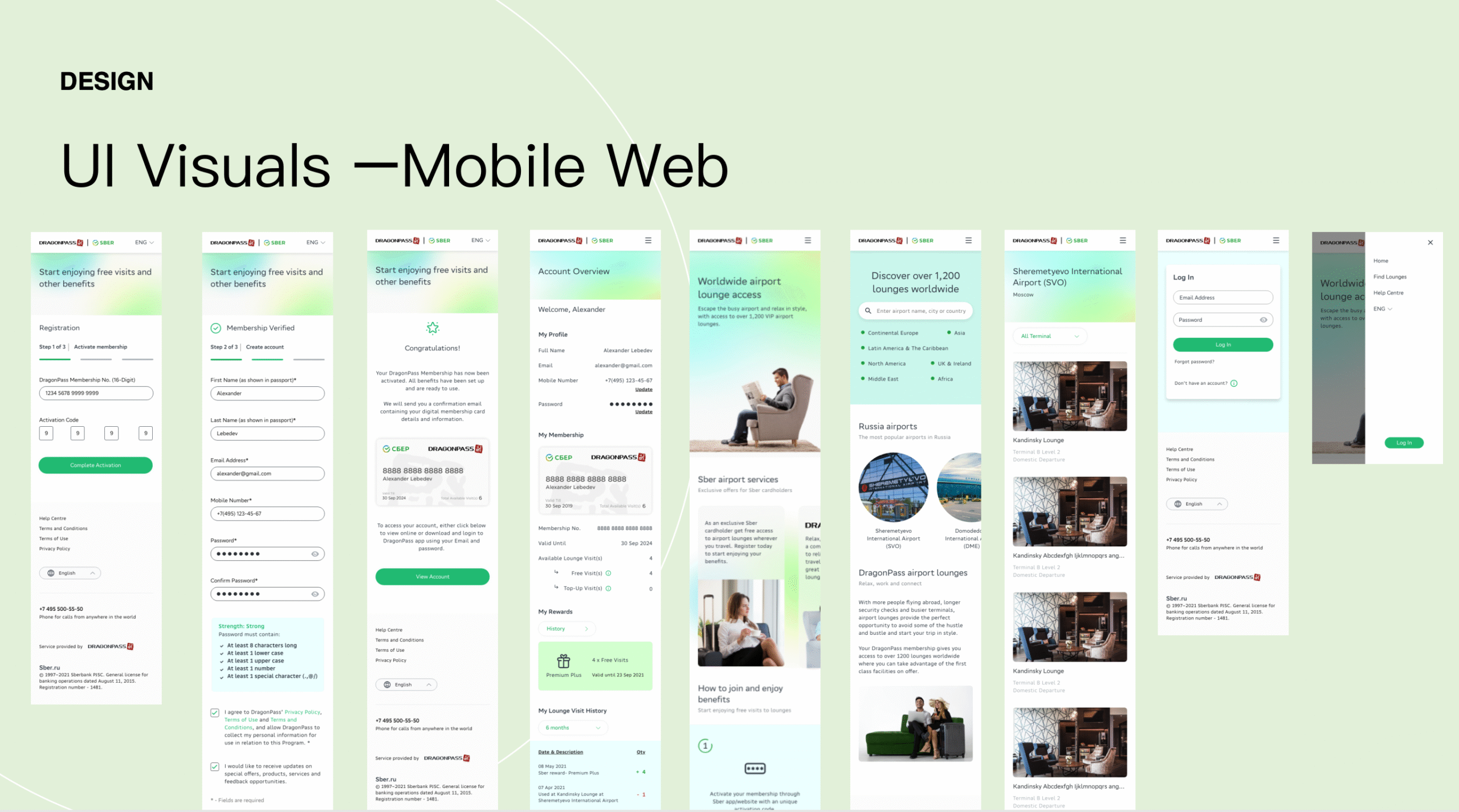
Responsive UI & Visual Design
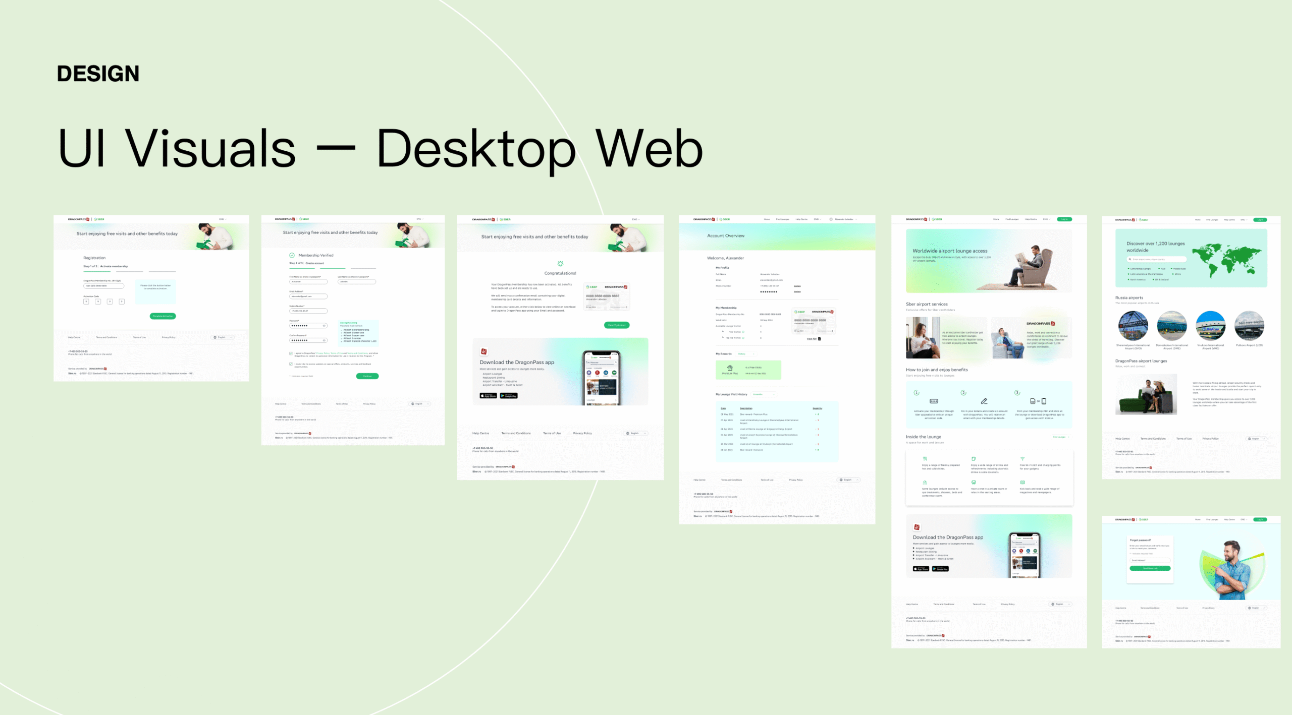
The website had to work across desktop and mobile while staying consistent with Sberbank’s existing digital experience.
This meant the design process was not simply about making a desktop layout responsive. I needed to make sure the interface followed the client’s established visual language and design patterns across different screen sizes.
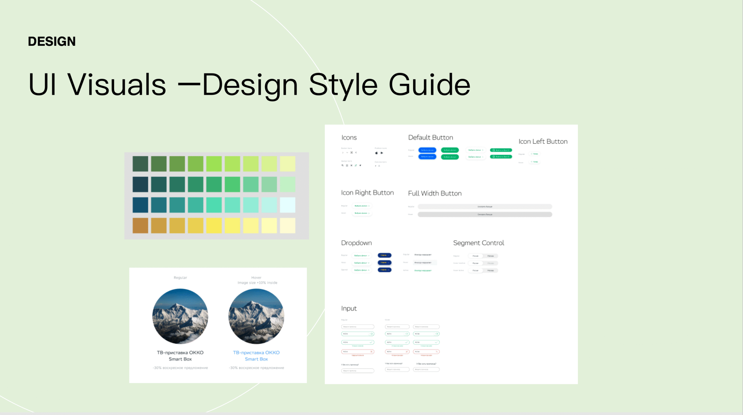
Working within Sberbank’s branding
I used Sberbank’s visual identity as the foundation for the website, including its branding, typography, colours, UI patterns, and overall visual tone.
The DragonPass functionality was integrated into that system rather than creating a separate DragonPass-looking experience.
This was important because users were entering the journey through a Sberbank benefit. The experience needed to feel consistent from the moment they clicked the benefit through to account activation.
Responsive layouts
I designed the main flows for both desktop and mobile, including:
- Registration
- Sber ID verification
- Activation code entry
- Password creation and validation
- Account management
- Benefit and visit information
The layouts were designed to adapt to different screen sizes while keeping the same hierarchy and interaction patterns.
Component and interaction states
Because the website was built within the client’s design system, consistency extended beyond the visual styling.
I defined reusable components and interaction states such as:
- Default
- Hover
- Active
- Disabled
- Error
- Validation
This helped keep the screens consistent and gave developers clearer specifications during implementation.
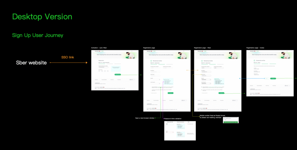
Edge cases
I also documented the less obvious states in the user journey, including situations such as:
- Incorrect activation details
- Forgot password
- Form validation errors
- Different onboarding outcomes
These cases were important because they could easily break the experience if they were only considered after development had started.
6
Key Features & Handoff
Flexible benefit redemption:
After onboarding, users could access their benefit in different ways depending on how they used the service.
Smartphone users could use the DragonPass mobile app and their digital membership while users who stayed on the web could access their account and view a printable PDF voucher.
This meant the experience did not assume that every Sberbank customer would use a smartphone app.
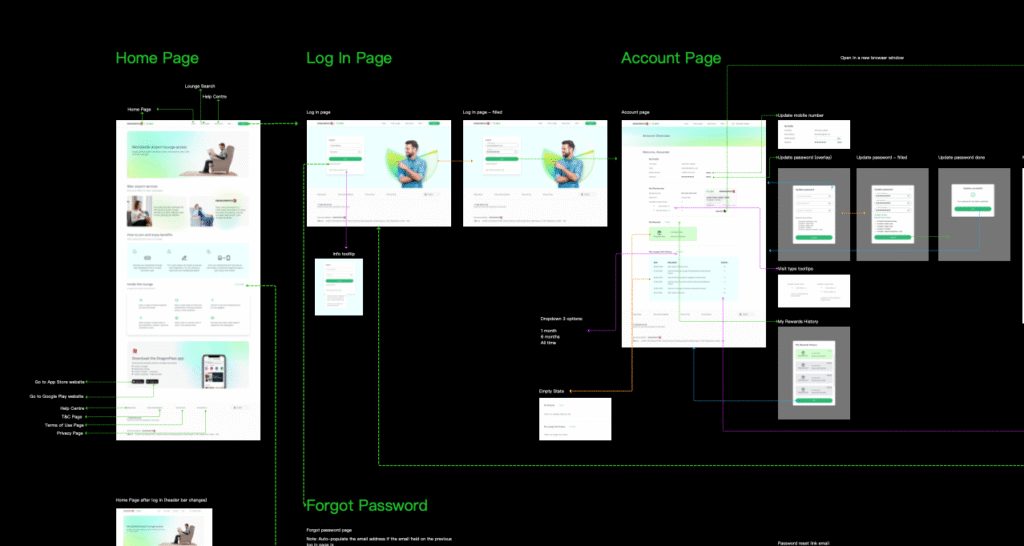
Account dashboard:
The dashboard was designed to make the most important information easy to find.
Users could see things such as their available complimentary visits, top-up options, and visit history without having to move through multiple pages.
I focused on keeping the information hierarchy simple so users could understand their membership status at a glance.
Comprehensive Technical Handoff:
Delivered complete user flow specs, state definitions (active, hover, disabled), and edge-case handling (e.g., app-not-installed redirects, forgot password flows) for development teams.
7
Results & Impact
The final solution gave Sberbank customers a responsive web entry point for the new digital lounge benefit.
More importantly, it created a bridge between Sberbank’s ecosystem and DragonPass without forcing every user into the same access method.
The solution supported:
App users
Complete onboarding through the responsive website and continue with digital access through the DragonPass app.
Web users
Complete onboarding and continue using the web experience.
Print-oriented users
Access a PDF voucher that could be printed and presented when using the benefit.
From a design perspective, the project also demonstrated how a third-party service can be integrated into an established client ecosystem without making the experience feel visually disconnected.
8
Next Steps
After launch, I would use analytics and user behaviour data to understand how people move through the onboarding journey.
The main areas I would monitor are:
Onboarding conversion
Track where users drop off during Sber ID verification, account creation, and activation.
App download behaviour
For users who complete onboarding on the web, measure how many continue to the DragonPass mobile app.
Device behaviour
Compare the mobile and desktop journeys to identify whether certain steps perform better on one device or need further optimisation.
The results could then be used to iterate on the onboarding flow and improve the overall conversion and activation experience.